A performance management gauge system in VPS provides an intuitive, graphic representation of assessments generated to evaluate achievement of the annual targets and performance goals. The gauge provides an at-a-glance indication of how well a particular element is performing across many attributes such as completion and budget.
Performance Management Scorecard
The scorecard tool provides the ability to navigate through the data elements in the system to assess progress and areas needing improvement. The performance management of the strategy elements in VPS are displayed in both numerical tabular formats and/or at-a-glance color-coded graphical format. Each type of element in the strategy is presented with different performance information depending on whether it is a Key Performance Indicators (KPI), a Task, a Question or an aggregate measure (e.g., objective, initiative). A performance management gauge for KPI is computed by comparing actual performance to the target, whereas the performance gauges for aggregate measures are computed from the weighted average.
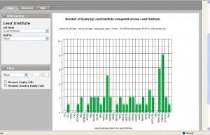
Rather than just presenting static reports, the scorecard enables decision-makers to dynamically analyze the information in VPS. An interactive multidimensional analysis tool in VPS allows program officers and decision-makers to analyze data in different ways from multiple viewpoints within NIH, to slice the information and drill down to more details, to pinpoint specific problematic areas and to identify potential opportunities. The scorecard supports both graphical and tabular formats (including export to Microsoft Excel) with a variety of analytic views, including trend, comparative trend, and comparative analysis. In Figure 1, a
sample graphical chart illustrates the number
of GPRA goals at NIH by Institutes leading the initiative. This information assists in the evaluation of the trans-NIH core criteria. The systematic assessment of program operations helps determine whether the programs in VPS are being conducted as planned, whether the information entered is the expected output, and how program-critical processes can be improved.
A dimension is used in VPS to structure and categorize measurement data for analysis. For example, a performance measure could be structured so that it can be analyzed over time. In this case, time is the dimension across which the performance
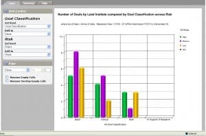
measure is analyzed. The graphical analysis tool in VPS supports charting across up to two dimensions, each dimension structured in a hierarchical format. For example, the performance measure could be analyzed across time and/or risk to show how each goal is performing over time. This information assists in the analysis of the core criteria: risk and time. An illustration of a Comparative Analysis is depicted
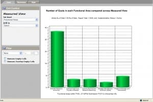
VPS users can explore more detailed information by drilling down to a lower level within a dimension. Depending on the type of analysis that is being done, users have several possibilities with the drilling down mechanism. For example, user could view the number of goals in each GPRA program plan, then drill down further to see all goals across all functional areas, as illustrated in Figure 3. Drilling further will reveal the number of targets across a goal. In VPS, when comparing across two dimensions, one of the dimensions will appear as the labels across the bottom of the chart, and the other dimension will appear in the legend. Each of the dimensions can be drilled down independently by clicking on the dimension member along the bottom of the chart, or by clicking on the dimension member name in the legend. Alternatively, users can click on the actual column in the chart to drill into both dimensions simultaneously. These analyses assist in the assessment of the balanced portfolio core criteria.
In addition to the drilling element, a filtering control also can be used to view the top or bottom element from a particular dimension. A user could choose to display only the top 10 lead Institutes in the chart, as illustrated in the pie chart in Figure 4. The filter is created in VPS by selecting the dimension to be filtered and selecting either Top or Bottom, and specifying the number of elements to be included in the filter. The graph will generate the filtered chart once these dimensions have been set.
Performance Management Conclusion
Various options exist for changing and customizing the graphing style in VPS. User may select graph types such as Area, Vertical Bar, Horizontal Bar, Line, and Pie chart types. The illustration in Figure 5 shows a typical line graph that would be displayed when charting the number of goals by lead Institute compared by goal classification across risk. Using the color scheme in VPS, users can also select from a variety of color choices to separate the elements on the graph.


